What Mobile Workforce Analytics Does for Deskless Teams

Mobile workforce analytics turns scattered location, time, and job data from your deskless teams into scheduling and staffing decisions that cut overtime, shrink idle hours, and raise utilization. The primary payoff is accuracy: schedules built on real travel times and job durations instead of guesswork. Get the data connected first, then metrics and implementation steps follow.
TL;DR:
- Connecting HRIS, payroll, scheduling, and mobile apps is essential to avoid data fragmentation and ensure accurate KPI tracking for mobile teams.
- Instrument travel time first, as it often reveals quick wins for payroll savings through route fixes and can predict overtime before issues occur.
- Use targeted short pilots focusing on one or two operational metrics to generate clear insights and avoid confusion from multiple simultaneous changes.
- Prioritize privacy and consent steps upfront, including data retention limits and access controls, especially for sensitive location data.
- Start with descriptive analytics to identify waste and validate the data quality before progressing to predictive and prescriptive models for automation.
Table of Contents
- What Is Mobile Workforce Analytics, Exactly?
- Which KPIs Should HR Track for Mobile Teams?
- Where Does the Data Come From, and How Do You Unify It?
- How Does Analytics Actually Improve Scheduling and Routing?
- How Do You Roll This Out Without Disrupting Operations?
- What Privacy and Governance Risks Should HR Address First?
- How Do You Prove ROI to Leadership?
- How Do You Measure Engagement Among Deskless Employees?
- Descriptive, Predictive, and Prescriptive Analytics for Mobile Teams
- What Does This Look Like in Real Field Operations?
- Which Tools Actually Support Mobile Workforce Analytics?
- How Do You Keep Improving After the Pilot Works?
- A Vendor’s View: Why the Audit Comes Before the Analytics
- Sources
What Is Mobile Workforce Analytics, Exactly?
General HR analytics looks at headcount, turnover, and engagement scores pulled mostly from an HRIS. Mobile workforce analytics adds a layer that office-based HR tools never had to handle — where someone was, when they got there, how long the job took, and whether the app was even connected at the time.
That distinction matters because field data behaves differently. A technician’s timesheet isn’t just a clock-in and clock-out. It’s a GPS ping at a job site, a photo timestamp confirming arrival, a task marked complete, and sometimes hours of offline data that syncs once the phone finds signal again. Traditional people analytics platforms weren’t built to reconcile that kind of noise.
Mobile workforce analytics typically pulls from:
- Location and geofencing data from field apps
- Job-level timestamps (arrival, start, completion)
- Offline activity logs that sync in batches
- Route and travel-time records
- Task completion and quality flags tied to specific jobs
Done right, this layer doesn’t replace your existing workforce management tools. It feeds them better inputs, so scheduling engines and payroll systems stop working off stale or incomplete assumptions about where people actually are.
Which KPIs Should HR Track for Mobile Teams?
Six metrics tell you almost everything you need to know about a mobile workforce: on-time arrival rate, average travel time per job, utilization (billable hours versus total shift hours), first-time fix rate, overtime hours, and idle time between jobs.
Split these into leading and lagging indicators. Travel time and idle time are leading signals, they shift in real time and predict the next week’s overtime spend before it happens. Overtime hours and turnover are lagging, they tell you what already went wrong. Watching only lagging KPIs is like driving using the rearview mirror.
Pro Tip: Instrument travel time before anything else. It’s the single easiest KPI to pull from GPS logs, and it usually exposes the fastest win, since a 10-minute routing fix across 50 technicians a day adds up to real payroll savings within a month.
Instrumentation doesn’t need to be complicated:
- On-time arrival: compare scheduled versus GPS-confirmed arrival timestamps
- Utilization: divide job-active minutes by total clocked minutes
- First-time fix: flag jobs closed without a follow-up ticket
- Overtime: track daily clocked hours against shift length by role
- Idle time: measure gaps between job completion and next check-in
The mobile worker population keeps expanding as more industries shift field operations toward app-based coordination, which is exactly why Statista’s mobile worker forecast shows steady growth. That scale is precisely why these six KPIs matter more each year, not less.
Where Does the Data Come From, and How Do You Unify It?
Five systems typically hold the pieces of your mobile workforce picture: your HRIS, payroll, scheduling software, mobile time/GPS apps, and whatever CRM or ERP tracks the actual jobs. None of them talks to the others by default.
That’s the core problem. Gartner’s review of Workday Workforce Management points to data fragmentation as one of the most common barriers organizations face when trying to get value from workforce analytics, and the fix isn’t a new dashboard. It’s connecting HRIS, payroll, and scheduling into a single source of truth before you build anything on top.
The usual integration patterns:
- APIs for real-time syncing between scheduling and mobile time apps
- Middleware to translate data formats between older payroll systems and newer field tools
- ETL pipelines for batch-loading historical data into a reporting layer
The most common failure point is identifier mismatch. Payroll knows an employee by one ID, scheduling by another, and the mobile app by a third. Map every worker to a single canonical ID before anything else, or your joins will quietly drop records and skew every KPI downstream.
Pro Tip: Test your integration on a rainy Monday, not a clean Tuesday. Offline sync issues and inconsistent GPS pings show up hardest when field crews are dealing with bad weather, spotty signal, and last-minute reschedules all at once.
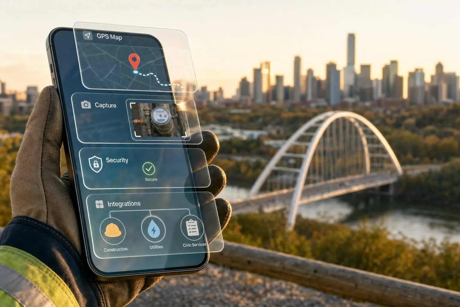
Mobile apps built for field service, like Klees and allGeo, already handle geofencing, photo verification, and offline capture on the capture side. The harder engineering work is almost always on the integration side, not the collection side.
How Does Analytics Actually Improve Scheduling and Routing?
Four use cases show up again and again once mobile data starts flowing into decisions instead of just sitting in a spreadsheet.
- Demand forecasting and shift right-sizing. Historical job volume by day and hour lets you staff shifts to match actual demand instead of a fixed headcount that’s wrong half the time.
- Skill-based matching. Automated shift recommendations pair the technician with the right certification to the job that needs it, instead of whoever happens to be free.
- Route optimization. Platforms like Workstatus combine location, time, and task data into one view, which is how field managers spot travel waste that a spreadsheet never would.
- Real-time exception detection. A technician stuck 40 minutes past expected job duration triggers a manager alert before the customer calls to complain.
None of this requires predictive AI on day one. Even descriptive dashboards showing yesterday’s travel times and idle gaps will surface enough waste to justify the next investment. The AI workforce scheduling approach for warehouses follows the same logic in a fixed-site context, unified data first, automated recommendations second.
How Do You Roll This Out Without Disrupting Operations?
Six steps take you from idea to a working pilot in roughly a quarter.
- Pick 2 to 3 outcome metrics. Overtime reduction, on-time arrival, and travel time are the easiest to measure and the fastest to move.
- Select a compact pilot cohort. One region, one crew, or one shift type, small enough to manage closely.
- Confirm mobile data capture works before you touch scheduling logic. Bad GPS coverage or app adoption gaps will sink the pilot before it starts.
- Run the pilot for 4 to 8 weeks. Longer pilots dilute the signal with seasonal noise; shorter ones don’t give the schedule changes time to settle in.
- Quantify the before/after on the pilot KPIs specifically, not company-wide averages.
- Scale with governance and training, meaning documented data ownership, access rules, and a plan for onboarding the next cohort.
Pro Tip: Instrument one KPI and one operational change at a time during the pilot, something like travel minutes per shift paired with a single route tweak. Measuring multiple changes at once makes it impossible to tell which one actually moved the number.
Short, targeted pilots on a high-variance segment tend to produce clearer signals than a company-wide rollout, mostly because the noise in a small, well-defined group is easier to explain. Integrating the new analytics into apps employees already use, rather than adding another login, is consistently the highest-leverage decision in this phase. Field teams that already juggle a scheduling app, a payroll app, and a messaging app will not adopt a fourth one without friction.
What Privacy and Governance Risks Should HR Address First?
Location and time tracking sit in genuinely sensitive territory. Employees notice when they’re being watched, and how you communicate the purpose of tracking matters as much as the tracking itself.
Four areas need attention before rollout, not after a complaint:
- Consent and purpose limitation: tell employees exactly what’s tracked and why, in writing, before the app goes live
- Retention limits: decide how long location and time data lives in your systems, and delete it on schedule
- Access controls: restrict who can see raw location data versus aggregated KPIs
- Device and connectivity limits: account for battery drain, poor rural signal, and personal-device policies upfront
5G rollout is gradually easing some of these technical limits by improving mobile data reliability in areas that used to drop signal constantly, but connectivity gaps haven’t disappeared, especially in rural field operations or underground work. Build your governance and consent framework as if spotty connectivity is permanent. Digitalfractal’s guidance on AI-driven HR compliance covers the consent and access-control side of this in more depth.
How Do You Prove ROI to Leadership?
Start with a baseline of what mobile inefficiency already costs: current overtime spend, average travel time per job, missed-appointment rate, and turnover among field staff. Without that baseline, any post-pilot number is just a claim.
The common benefit levers, in order of how fast they usually show up:
- Overtime reduction from better shift right-sizing, visible within weeks
- Travel time savings from route optimization, visible almost immediately once GPS data flows
- Retention gains from more predictable schedules, which take longer, usually a full quarter or two, to show up in turnover numbers
A simple calculation template works fine here: (baseline overtime hours minus pilot overtime hours) multiplied by average hourly rate, run against the pilot cohort only. Tools like the workflow automation savings calculator can help structure that math for a leadership presentation. Short pilots produce the most credible figures precisely because they isolate one change instead of six.
How Do You Measure Engagement Among Deskless Employees?
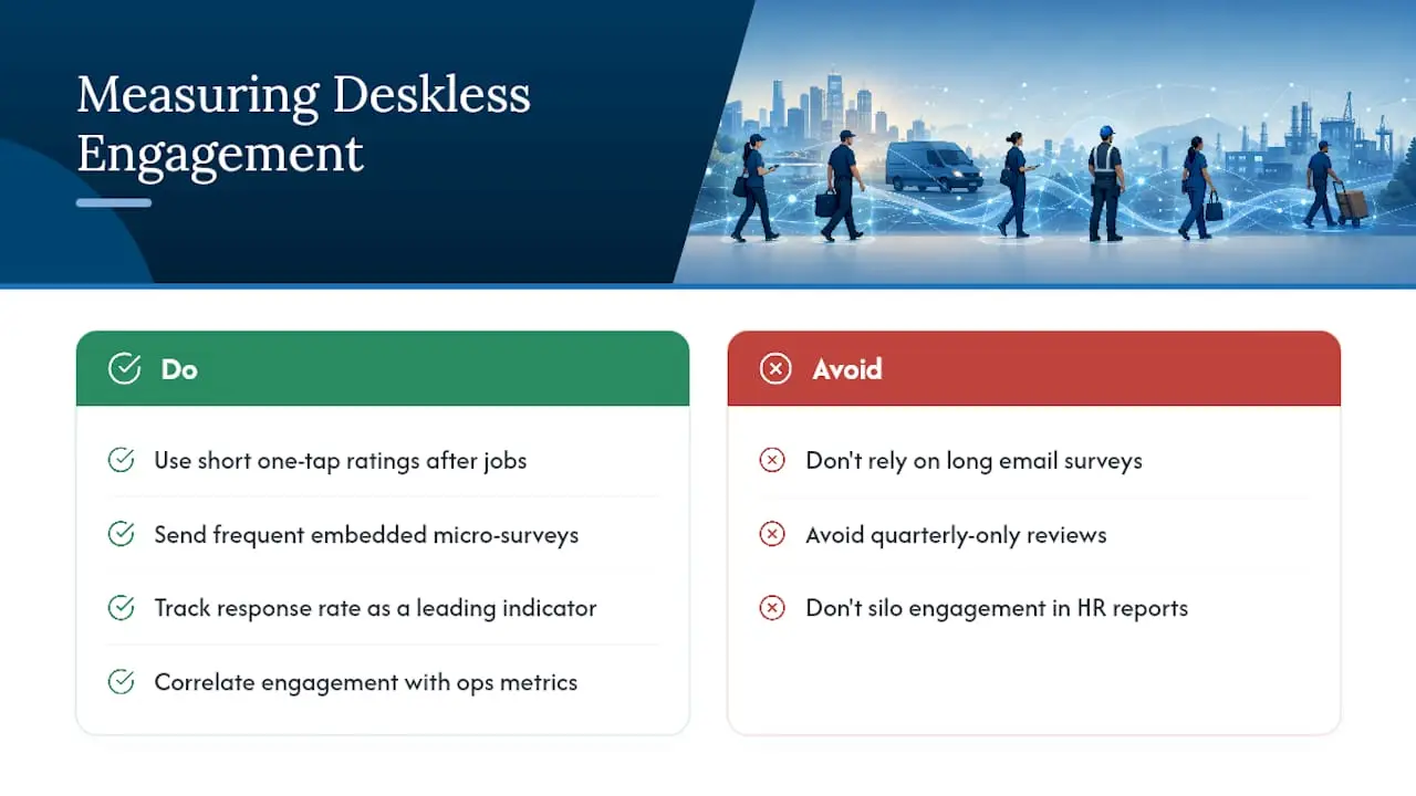
Standard engagement surveys, the annual pulse check sent to every corporate inbox, mostly fail with mobile teams. Field workers don’t check email between jobs, and a 20-question survey competes with an actual job queue.
What works instead is short, frequent, and embedded in the tools they already touch. A one-tap rating after job completion (“How did that go, 1 to 5?”) captures far more responses than a quarterly survey link buried in an email nobody opens on a job site. Response rate is itself a signal worth tracking: a sudden drop in survey participation often precedes a spike in turnover by weeks, which makes it a leading indicator worth watching alongside your operational KPIs.
Look for patterns HR wouldn’t catch manually: engagement scores that dip specifically after schedule changes, or crews that report lower satisfaction on jobs with longer travel times. That correlation alone can justify a routing fix that operations might otherwise dismiss as a minor inconvenience.
Manager check-ins matter more for deskless teams than for office staff, mostly because there’s no hallway conversation or lunchroom chat to catch problems informally. A field supervisor who reviews utilization and idle-time data alongside a quick weekly text check-in catches burnout signals that a quarterly review would miss entirely. Treat engagement data with the same rigor as productivity data. Feed it into the same dashboard, not a separate HR-only report that operations managers never see.
Descriptive, Predictive, and Prescriptive Analytics for Mobile Teams
Most organizations start with descriptive analytics, and that’s the right call. Descriptive analytics answers “what happened”: average travel time last month, overtime by region, on-time arrival by crew. It’s the easiest to build, the easiest to trust, and it usually surfaces enough obvious waste to fund the next stage.
Predictive analytics answers “what’s likely to happen”: forecasting which shifts will run into overtime based on historical job volume and weather patterns, or flagging which technicians are trending toward burnout based on rising idle time and falling engagement scores. This requires more historical data, typically six months to a year of clean, unified records, before the predictions are trustworthy enough to act on.
Prescriptive analytics goes a step further and recommends the action: automatically suggesting a schedule adjustment, or routing the next job to a different technician based on current location and remaining capacity. Few mobile workforce programs reach this stage in year one, and that’s fine. Rushing to prescriptive analytics before the descriptive layer is solid just means automating decisions on top of bad data.
The practical sequence matters more than the labels. Build descriptive dashboards first, validate them against what managers already know to be true, then layer in predictive models once you trust the inputs. Prescriptive automation comes last, and only once the predictions have proven reliable for a few cycles.
What Does This Look Like in Real Field Operations?
Logistics and delivery operations lean hardest on route optimization and travel-time reduction, since travel is often the single largest chunk of a driver’s paid hours that produces zero revenue. Shaving even a few minutes per stop compounds fast across a full route.

Construction crews track a different mix: job-site arrival verified by GPS, task completion tied to specific project phases, and overtime driven by weather delays or material shortages rather than routing inefficiency. The analytics questions shift from “how do we get there faster” to “why did this phase run long, and was it the crew or the conditions.”
Field service and equipment maintenance, HVAC repair, industrial servicing, oil and gas field techs, care most about first-time fix rate and utilization. A technician who drives 45 minutes to a job only to discover the wrong part was loaded onto the truck is a data problem as much as a logistics problem, and it shows up clearly once job-level data gets tracked consistently.
Home health and care services face the tightest privacy considerations of any deskless category, since location data intersects with patient visits, but the scheduling payoff, matching the right caregiver to the right client based on skills and travel proximity, is often the largest efficiency gain available in that sector.
Across every one of these industries, the pattern repeats: the win doesn’t come from a single flashy metric. It comes from connecting the data that already exists across separate systems and finally looking at it together.
Which Tools Actually Support Mobile Workforce Analytics?
The tool landscape splits into three rough categories, and most organizations end up using more than one.
Mobile time and GPS apps handle the raw data capture: geofencing, photo verification, offline sync, and payroll export. This is the foundation layer, and without clean capture here, nothing built on top of it is trustworthy.
Work intelligence platforms sit a level up, combining location, time, task, and attendance data into dashboards built specifically for field managers rather than corporate HR. These are useful when the goal is operational visibility: who’s where, how long jobs are taking, where travel waste is concentrated.
Enterprise workforce management suites, the kind reviewed on platforms like Gartner Peer Insights, handle the heavier integration work: connecting HRIS, payroll, and scheduling into a governed, auditable system of record. This is where the single source of truth actually gets built, and it’s usually the right investment once a pilot has proven the concept on a smaller scale.
Digitalfractal’s AI-powered mobile app analytics guide covers the telemetry and offline-sync side of this stack in more detail, and field-service platforms like MDMS offer offline-capable capture built specifically for equipment-heavy operations. The right stack depends less on company size and more on how fragmented your current systems already are, and how much of that fragmentation you’re willing to fix before you buy anything new.
How Do You Keep Improving After the Pilot Works?
A dashboard that nobody revisits after the pilot ends is worse than no dashboard at all, because leadership assumes the problem is solved. Set a recurring review cadence, monthly at minimum, weekly during the first two quarters after scale, where operations and HR look at the same KPI trends together.
Watch for drift. A KPI that looked great in the pilot can quietly degrade as the cohort grows: travel-time savings that held for 50 technicians sometimes evaporate at 500 if routing logic wasn’t built to handle that scale. Rebaseline your targets every two quarters rather than assuming month-one benchmarks hold forever.
Build in a feedback loop from the field itself. The people generating the data, technicians, drivers, care workers, notice operational problems long before a dashboard does. A simple channel for reporting “this metric doesn’t match what’s actually happening” catches data quality issues that would otherwise quietly poison every KPI downstream.
Finally, treat governance as ongoing maintenance, not a one-time setup task. Access permissions, retention schedules, and consent language all need periodic review as teams grow, systems change, and new privacy expectations emerge.
A Vendor’s View: Why the Audit Comes Before the Analytics
Most organizations jump straight to dashboards before checking whether their underlying data can even support one. An AI readiness audit surfaces exactly that: data quality gaps, which systems are duplicating identifiers, and where automation, an AI scheduling agent, punch-to-payroll automation, mobile data cleanup, can produce faster wins than a new reporting layer ever would.
Digitalfractal builds these audits specifically to find the automation candidates hiding in fragmented field data before recommending a single tool. If you’re staring at three disconnected systems and no clear starting point, Digitalfractal’s AI Readiness Audit or a direct look at AI integration consulting is the faster path than building a dashboard on data you haven’t yet trusted.
— Souhail
Sources
- Statista: mobile worker population forecast
- Klees — GPS time tracking & field ops for any field team
- allGeo — Employee GPS time clock and geofencing
- Workstatus — Work intelligence platform for field managers