
Best Practices for Accessible Web Apps
Creating accessible web apps isn’t just good practice – it’s required by Canadian law. With 27% of Canadians aged 15+ living with disabilities, accessibility ensures millions can access digital services. The Accessible Canada Act (ACA) and Digital Technologies Accessibility Regulations define clear standards, like WCAG 2.1 and 2.2, to be met by 2027–2028 for most organizations.
Key takeaways:
- Legal compliance: ACA mandates accessible web apps by specific deadlines, with penalties up to $250,000 for violations.
- Accessibility principles: Follow POUR (Perceivable, Operable, Understandable, Robust) and WCAG 2.1/2.2 standards.
- Tools: Use automated tools (axe, Lighthouse) and manual testing (screen readers, keyboard-only navigation).
- Design tips: Ensure proper colour contrast, clear navigation, and readable content.
- Development tips: Use semantic HTML, manage focus effectively, and handle dynamic content updates with ARIA live regions.
Accessibility isn’t an afterthought – it’s built into design, development, and testing to create web apps usable by all.
The Ultimate Accessibility Checklist: WCAG 2.2 A/AA/AAA
sbb-itb-fd1fcab
Accessibility Standards and Principles Explained
Accessibility Testing Tools: WCAG Coverage Comparison
Understanding accessibility standards is crucial for creating AI enhanced mobile and web apps that work for everyone. In Canada, these standards are not just technical – they align with legal requirements your organisation must meet.
The POUR Principles: Perceivable, Operable, Understandable, Robust
Accessibility guidelines are built on four main principles, collectively called POUR. These principles form the backbone of the WCAG framework.
| Principle | What It Means | Key Requirement (WCAG 2.1 AA) |
|---|---|---|
| Perceivable | Users can see or hear your content | Text alternatives, live audio captions, 4.5:1 contrast ratio |
| Operable | Users can navigate and interact | Keyboard navigation, no keyboard traps, focus indicators |
| Understandable | Users can make sense of the interface | Predictable navigation, clear error messages |
| Robust | Content works with assistive tech | Semantic HTML, ARIA roles, status messages |
If your content isn’t perceivable or operable, the other principles won’t matter. All four must work together as a unified system.
As WebAIM aptly states:
"Web accessibility is most easily achieved when people are at the centre of the process."
WCAG 2.1 and 2.2: What You Need to Know
WCAG 2.1, released in June 2018, is the standard referenced by Canadian federal law. It added 17 new success criteria to address mobile accessibility, touch interfaces, and low-vision users. Meeting WCAG 2.1 Level AA is considered equivalent to complying with the web-specific clauses of Canada’s CAN/ASC-EN 301 549:2024 standard.
WCAG 2.2, introduced in December 2024, includes 9 additional success criteria, such as Focus Not Obscured, Dragging Movements, and Target Size (Minimum). These updates place greater emphasis on cognitive disabilities and mobile usability. Importantly, it’s backwards compatible – achieving compliance with WCAG 2.2 automatically satisfies WCAG 2.1 and 2.0. The W3C recommends:
"While WCAG 2.0 and WCAG 2.1 remain W3C Recommendations, the W3C advises the use of WCAG 2.2 to maximize future applicability of accessibility efforts."
For Canadian organisations, Level AA is the goal – not Level AAA. The W3C itself notes that achieving Level AAA across an entire site isn’t practical because some content types can’t meet all the criteria.
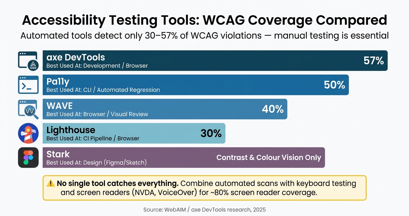
Tools to Help You Check and Maintain Accessibility
Turning accessibility standards into reality requires effective testing tools. However, no single tool can catch every issue. Automated tools typically detect only 30% to 57% of WCAG violations, making manual testing a critical part of the process. The most effective strategy combines automated scans with hands-on testing using keyboards and screen readers.
Here’s a breakdown of tools suited for different stages:
| Tool | Best Used At | WCAG Coverage |
|---|---|---|
| axe DevTools | Development / browser | ~57% |
| WAVE | Browser / visual review | ~40% |
| Lighthouse | CI pipeline / browser | ~30% |
| Pa11y | CLI / automated regression | ~50% |
| Stark | Design (Figma/Sketch) | Contrast & colour vision |
For screen reader testing, NVDA (free, open-source, Windows) and VoiceOver (built into macOS) cover about 80% of actual screen reader usage. If you’re working in a design tool like Figma, Stark allows you to simulate colour blindness and check contrast before any code is written – catching issues early, when fixes are cheapest. When prioritizing these fixes, using a custom app feature planner can help you balance accessibility requirements with your project budget.
A quick tip: always test your app at 200% zoom and a viewport width of 320 pixels. This ensures compliance with WCAG Criterion 1.4.10 (Reflow), which prevents horizontal scrolling on small screens or when text is enlarged.
These strategies lay the groundwork for accessible design and development practices that will be explored further.
Accessible UX and UI Design: Best Practices
When it comes to accessible web apps, good UX and UI design make all the difference. By following the POUR principles and WCAG guidelines, you can create experiences that work for everyone – not just some users. Accessibility isn’t something to tack on later; it starts with thoughtful decisions about colour, layout, and text sizing during the design phase. Planning ahead helps you avoid costly fixes down the road and ensures your app meets established accessibility standards.
Visual Design for Accessibility
Colour contrast is a key factor in accessibility. For body text, a contrast ratio of at least 4.5:1 is required, while larger text (18pt or 14pt bold) needs a minimum contrast of 3:1. Alarmingly, a 2025 WebAIM report revealed that 95.9% of websites fail basic accessibility checks, with an average of 51 errors per page.
Don’t rely solely on colour to convey important information. For instance, if a form field highlights errors by turning red, include an icon or text label to ensure users with colour-perception differences can still understand the message. To meet WCAG Criterion 1.4.4, use rem units for font sizes, making text scalable up to 200% without losing functionality or clarity.
Navigation and Interaction Design
Interactive elements like buttons, links, and form fields must be fully operable using a keyboard. To achieve this, ensure natural tab order and maintain visible focus indicators. If you remove browser focus outlines, provide an alternative that’s easy to see.
Adhere to WCAG 2.2 requirements for smooth navigation. For example, Success Criterion 2.4.11 (Focus Not Obscured) ensures sticky headers or banners don’t block focused elements. Similarly, Success Criterion 2.5.7 (Dragging Movements) requires alternatives for drag interactions, such as buttons or clickable tracks, for actions like moving sliders or items on kanban boards. Additionally, include a "skip to content" link at the top of each page to help keyboard users bypass repetitive navigation and jump straight to the main content.
"A web page or application with a well formed semantic structure can allow users without vision to identify, navigate and interact with a visual user interface." – Government of Canada
Content Clarity and Readability
Clear, straightforward content is essential for accessibility. Aim for a reading level equivalent to lower secondary education (ages 11–14). Use plain language, keep sentences short, and write in the active voice. Clearly label interactive elements to support users with cognitive or learning disabilities.
Make sure to specify the page language using the lang attribute in your HTML tag. This helps screen readers apply the correct pronunciation, which is especially important for bilingual audiences in Canada who use both English and French. When giving instructions, avoid relying solely on sensory cues like shape or position. Instead of saying "click the green button", be more specific: "click the green button labelled Submit".
Development Practices for Accessible Web Apps
Creating accessible web apps isn’t just about design; the way developers write code plays a huge role too. Decisions around HTML structure, keyboard usability, and dynamic updates can make or break an app for users relying on assistive tools.
Semantic HTML and ARIA Roles
Stick to native HTML elements whenever possible. For example, a <button> already comes with built-in features like keyboard support, focus handling, and screen reader compatibility. On the other hand, a <div role="button"> forces you to manually code all of that functionality.
The W3C puts it best:
"If you can use a native HTML element or attribute with the semantics and behaviour you require already built in… then do so." – W3C
HTML5 sectioning elements like <main>, <nav>, <header>, and <footer> naturally create landmarks for screen readers, helping users navigate quickly. These elements already include implicit ARIA roles, so adding redundant attributes like <nav role="navigation"> just clutters your code.
ARIA is there to complement HTML, not replace it. Misusing ARIA can lead to more problems than it solves. According to the 2026 WebAIM Million report, home pages using ARIA averaged 59.1 detectable errors, compared to 42 errors on pages without it. As Level Access explains:
"Using ARIA incorrectly produces more accessibility errors than not using it." – Level Access
Keep in mind that ARIA only changes how assistive technologies interpret elements. It doesn’t make elements interactive by itself.
Once you’ve built a strong semantic foundation, the next step is ensuring all interactive elements are fully accessible via keyboard.
Keyboard Navigation and Focus Management
Every interactive element in your app must work seamlessly with a keyboard. Users should be able to navigate through the page in a logical order that mirrors its visual layout. Avoid using positive tabindex values like tabindex="1" – these disrupt the natural flow and can become a nightmare to maintain as your app evolves.
When you need to manage focus programmatically, use tabindex="-1". This is especially critical for Single Page Applications (SPAs), where route changes don’t reload the page. After navigation, shift focus to the new page’s main heading or container so screen reader users aren’t left stuck at the previous location.
For complex widgets like dropdown menus or tab lists, the roving tabindex technique is a lifesaver. This method keeps only one item in the tab sequence at a time (tabindex="0"), while the rest are set to tabindex="-1". Users can then navigate through items using arrow keys, avoiding the need to tab through every single option.
Modal dialogs require extra care. When a modal opens, focus should automatically move into it. While the modal is open, focus must stay trapped inside – users shouldn’t be able to tab to elements behind the overlay. Additionally, pressing Esc should close the modal and return focus to the element that triggered it.
Making Dynamic Content Accessible
Dynamic content updates are common in modern apps, but they can leave screen reader users in the dark if not handled properly. For instance, sighted users can see when search results update or when a cart total changes, but screen reader users need explicit announcements. This is where ARIA live regions come into play.
Adding aria-live="polite" to a container tells the screen reader to announce its content when the user is idle, without interrupting them. For urgent messages – like a session timeout or payment failure – use aria-live="assertive", which interrupts immediately. However, use assertive updates sparingly, as they can cut users off mid-sentence and cause confusion.
Here’s a quick guide to the two most common live region roles:
| Role | Politeness | Best Used For |
|---|---|---|
role="status" |
Polite | Success messages, saved confirmations, cart updates |
role="alert" |
Assertive | Critical errors, session timeouts, payment failures |
Make sure the live region container exists in the DOM before adding dynamic content. If you inject both the container and its content at the same time, screen readers might miss the update. Set up the container during page load and update its content dynamically as needed.
For SPAs, don’t forget to update document.title whenever the route changes. Also, shift focus to the new <h1> or announce it via a live region. Without these steps, screen reader users might experience the "silent navigation problem" – where content changes but nothing is announced.
Testing and Maintaining Accessibility Over Time
Automated and Manual Accessibility Testing
Automated tools can identify about 30–40% of WCAG failures. Platforms like axe DevTools, Lighthouse, and Pa11y are great for catching technical issues such as missing alt attributes, duplicate IDs, or low colour contrast. However, the majority of accessibility issues – around 60–70% – require manual intervention.
"Automated tools gate every PR; manual tests gate every release." – A11yPath
Manual testing bridges the gaps where automation falls short. A standout method is the "No Mouse Challenge": navigate your entire application using only a keyboard. This ensures that every interactive element is accessible via Tab, operable with Enter or Space, and visually highlighted with a focus indicator. Additionally, check that content adjusts properly at 200% zoom without introducing horizontal scrolling. For screen reader compatibility, automated scans should be paired with hands-on testing using tools like NVDA and VoiceOver to ensure assistive technologies function as expected in real-world scenarios.
To keep accessibility consistent, integrate automated checks into your CI/CD pipeline with tools like axe-core or Pa11y. This approach helps catch regressions early, before they reach production.
These practices not only improve accessibility over time but also create a solid foundation for incorporating user feedback and maintaining thorough documentation.
Collecting User Feedback on Accessibility
No matter how thorough your testing, real-world usage often reveals issues you may have overlooked. Users with disabilities might face challenges due to unique contexts – tight deadlines, specific devices, or particular assistive technology setups. To address this, provide a clearly labelled feedback channel with transparent response timelines.
When users report accessibility barriers, treat their feedback as a priority rather than just another support ticket. Classify issues based on severity:
- Critical: Prevents task completion
- Serious: Causes major difficulties
- Moderate: Creates challenges but doesn’t block tasks
- Minor: Low impact
Each category should have clear resolution timelines. This structured approach ensures issues are resolved promptly and prevents them from lingering in a backlog.
Accessibility Documentation and Team Training
Publishing an accessibility statement on your site and updating it annually helps keep your team accountable. It also informs users about known issues and how they can get assistance. For Canadian businesses selling to government or large enterprises, a Voluntary Product Accessibility Template (VPAT) is often required to demonstrate WCAG 2.2 compliance during procurement. Additionally, Ontario businesses must file an Accessibility Compliance Report by 31 December 2026, which involves documenting audits and remediation plans.
Training is another key component. Under the Accessible Canada Regulations, federally regulated organisations must provide accessibility training to employees involved in developing, maintaining, or purchasing digital technologies. Initial training must be completed by 5 December 2027, with refreshers required at least every three years. Embedding accessibility into your Definition of Done, code reviews, and release criteria ensures it’s treated as a fundamental quality standard, not an afterthought.
Conclusion: Taking the Next Step Toward Accessible Web Apps
Building accessible web apps is an ongoing process. It involves applying the POUR principles, adhering to the latest WCAG standards, crafting semantic HTML, managing keyboard focus, and conducting both automated and manual tests. Each of these steps plays a role in creating a more inclusive digital experience.
By prioritizing thoughtful design, development, and testing practices, organizations can establish a strong foundation for compliance. In Canada, this work is especially pressing. The Accessible Canada Act imposes penalties of up to CAD $250,000 per violation for non-compliance. With deadlines fast approaching for public and large private sector organizations, the urgency to act is clear. As highlighted by the Government of Canada:
"The ICT Standard was selected because it is the most comprehensive and internationally recognized digital accessibility standard… it goes beyond web accessibility." – Canada.ca
Meeting these standards requires more than just technical updates – it calls for a shift in mindset. Accessibility needs to be part of every aspect of your operations, from procurement and training to development workflows, ensuring barriers are identified, removed, and reported continuously.
FAQs
Do I need WCAG 2.1 or 2.2 for Canadian compliance?
For federal compliance in Canada, the CAN/ASC-EN 301 549 standard is key. This standard integrates the WCAG 2.1 Level AA criteria, ensuring digital accessibility across platforms. While some provinces, such as Ontario, continue to follow WCAG 2.0, the federal digital standard has adopted WCAG 2.1 to stay current.
Companies like Digital Fractal Technologies Inc specialize in creating custom software that adheres to these standards. Their solutions not only help organizations meet compliance requirements but also deliver accessible and high-performing web applications.
What accessibility checks should we run in CI/CD?
Integrating automated tools like axe-core, Pa11y-CI, or Lighthouse CI into your CI/CD pipeline can help you identify accessibility issues early in the development process. These tools are great for catching problems like missing alt text or contrast errors before they make it to production. Additionally, implementing component-level linting tools, such as eslint-plugin-jsx-a11y, on code commits can ensure accessibility standards are maintained at the code level. You can also enforce quality gates, like requiring a minimum accessibility score, to keep your project on track.
However, keep in mind that automated tools only identify about 30–40% of accessibility issues. To address the gaps, manual testing is essential. This includes checks for keyboard navigation, screen reader compatibility, and cognitive usability to ensure a more inclusive user experience. Combining automation with thorough manual testing creates a more robust approach to accessibility.
How can SPA route changes work with screen readers?
When working with Single Page Applications (SPAs), it’s important to make route changes accessible for all users. Here’s how you can do that:
- Notify users of navigation changes: After a route change, update the document’s title to reflect the new page. This helps users understand where they are within the application.
- Manage keyboard focus: Shift the focus to the new page’s primary heading (
h1). To do this, set itstabindexto-1and then callfocus(). This ensures that users navigating via keyboard or assistive technologies can immediately access the main content. - Use an aria-live region: Another option is to announce the route change by updating the text content of an
aria-liveregion with the new page’s title. This provides a clear auditory cue for screen reader users.
Both approaches ensure that navigation within your SPA is seamless and inclusive for all users.