Multi-Platform Responsive App Design Checklist | Digital fractal , Edmonton, AB
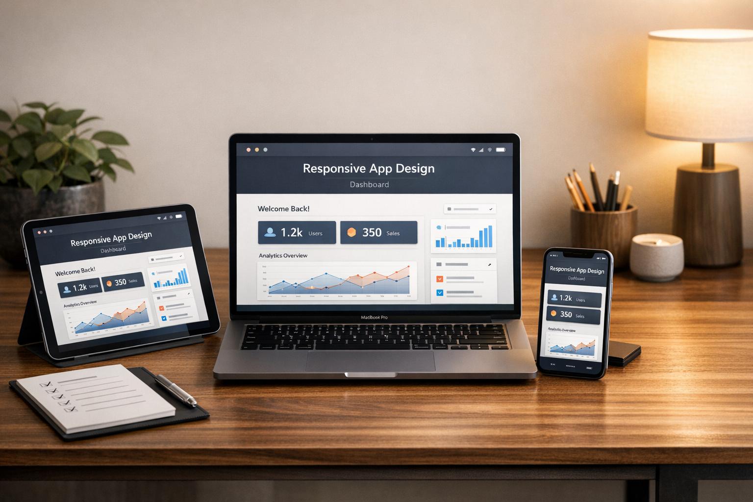
Responsive app design ensures your app works smoothly across smartphones, tablets, and desktops using a single codebase. This approach is critical for businesses, as over 58% of global web traffic comes from mobile devices, and users expect fast, functional, and attractive interfaces on any screen size. Here’s what you need to know:
- Start with mobile-first design: Focus on smaller screens first, ensuring core features are optimized for mobile users.
- Use breakpoints, not specific devices: Design for viewport sizes (e.g., 360×640 for mobile, 1366×768 for laptops) instead of platforms like iOS or Android.
- Create a design system: Use fluid grids, scalable typography, and SVG files to ensure consistency and efficiency.
- Flexible layouts: Implement CSS Grid and Flexbox for adaptable layouts, and use container queries for precise adjustments.
- Optimized media: Use modern formats like WebP, lazy loading, and responsive images to reduce load times.
- Thorough testing: Test on real devices and simulate various network conditions to ensure smooth performance and accessibility.
Responsive design is challenging but essential for user satisfaction and business success. A well-planned strategy, efficient design practices, and rigorous testing can help you deliver a polished app across all platforms.
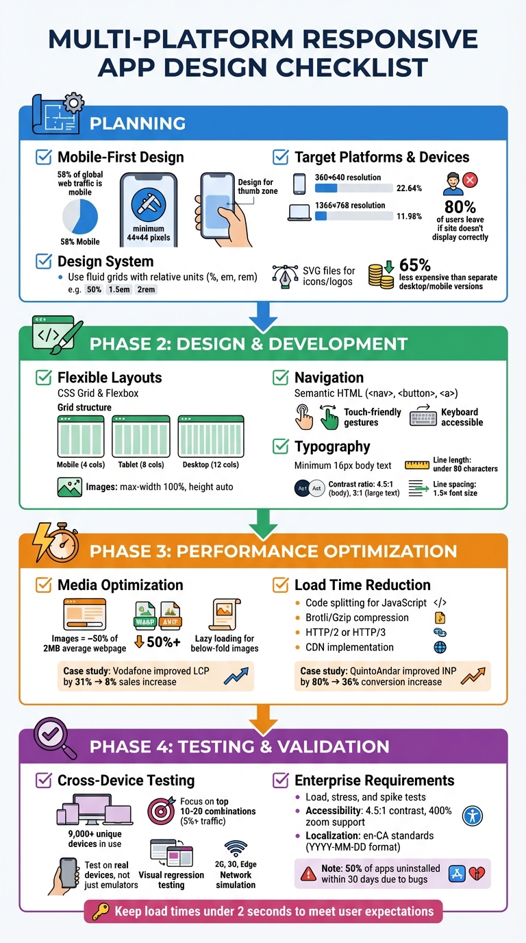
Multi-Platform Responsive App Design Checklist: 4-Phase Implementation Guide
Planning Phase: Setting Up Your Responsive Design Strategy
Start with Mobile-First Design
With mobile devices accounting for 58% of global web traffic, starting with a mobile-first design isn’t just smart – it’s essential. This approach prioritizes the core features users need most on smaller screens. Once you’ve nailed down these features for a 360-pixel-wide display, scaling up to larger screens, like desktops, becomes much simpler. On the other hand, trying to shrink a complex desktop interface for a phone can quickly turn into a nightmare.
Make sure your design supports taps, swipes, and pinches, with touch targets sized at least 44 x 44 pixels, as recommended by WCAG. Place key navigation elements within the "thumb zone" – the area that’s easiest to reach during one-handed use. Since mobile users are often on the go, dealing with spotty connections in transit or outdoors, implement progressive disclosure. This means showing only the information needed for the current task, keeping the interface clean and focused.
Choose Your Target Platforms and Devices
Instead of designing for specific devices, focus on breakpoints – the points where your layout visually breaks. You can find these by resizing your browser until the design no longer works, then using those dimensions as your breakpoints. Build your responsive styles around viewport size rather than trying to differentiate between platforms like iOS or Android.
Currently, a 360×640 resolution holds a 22.64% market share for mobile devices, while 1366×768 dominates laptops with 11.98%. These stats provide a solid starting point, but keep in mind that 80% of users will leave a site if it doesn’t display correctly on their device. To streamline development and testing, define an exact list of supported browser versions, such as Chrome 110 on Android 13, rather than using broad categories. And don’t forget to include the viewport meta tag: <meta name="viewport" content="width=device-width,initial-scale=1">. This ensures mobile browsers don’t render your pages at desktop widths.
Once your breakpoints and platforms are set, use a design system to ensure consistency across devices.
Create a Design System
The mobile-first mindset naturally leads to building scalable, reusable design components. A component-based architecture breaks your interface into smaller, modular pieces, ensuring consistency across platforms. Use fluid grids with relative units like percentages, em, or rem to create layouts that adapt proportionally to different screen sizes. Similarly, typography should use rem or viewport units, possibly combined with calc(), to keep text legible and zoomable.
For icons and logos, opt for SVG files. They’re lightweight and retain their sharpness at any resolution. A centralized pattern library or style guide can further reduce code duplication and ensure the team sticks to the same standards for spacing, colours, and UI elements. This cohesive approach can make maintaining a single responsive site 65% less expensive than managing separate desktop and mobile versions.
Design and Development: Creating the Responsive Interface
Use Flexible Layouts and Grids
Once your design system is in place, it’s time to focus on building layouts that adjust smoothly across different devices. Use Flexbox for arranging items in one dimension and CSS Grid for more complex, two-dimensional layouts. Flexbox ensures elements can expand or shrink to fit their containers, while CSS Grid uses the fr unit to divide space proportionally across rows and columns. A common approach is to design grids with 4 columns for mobile, 8 for tablets, and 12 for desktops, maintaining consistent gutters and margins for a clean, balanced look.
To ensure images and videos scale properly, set their max-width to 100% and height to auto. If your layout requires more precision, consider container queries (@container) to fine-tune component adjustments based on the size of their parent containers.
Design Navigation for Touch and Keyboard
Navigation must work seamlessly for both touch and keyboard users. Use semantic HTML elements like <nav>, <button>, and <a> combined with ARIA roles to make navigation accessible for screen readers. Ensure focus indicators are clear and that the focus order follows the visual layout, preventing users from getting stuck in any section.
For touch interactions, aim for intuitive gestures. Implement actions on the "up-event" (when the user lifts their finger) to allow users to cancel actions if needed. Avoid relying solely on advanced gestures like swiping – always provide simpler alternatives like taps or clicks to ensure inclusivity.
Set Typography and Readability Standards
Typography should be flexible and scalable. Use relative units like rem, em, or percentages for font sizes. Base body text at a minimum of 16 pixels for readability. To create fluid typography that adjusts across screen sizes, use the calc() function with viewport units, such as font-size: calc(1rem + 1vw).
Accessibility is key: maintain a contrast ratio of at least 4.5:1 for body text and 3:1 for larger text or graphics. For better readability, keep line lengths under 80 characters (or 40 for CJK text), space lines at least 1.5 times the font size, and use larger paragraph spacing. Always align text flush-left to provide a consistent starting point for the eye, avoiding justified text, which can lead to uneven spacing and disrupt readability.
Performance Optimization: Improving Speed and Efficiency
Optimizing Media and Images
Images make up nearly half of a typical webpage’s 2 MB transfer size, making them a prime area for improvement. To start, use the srcset and sizes attributes in your <img> tags. These allow browsers to automatically choose the most suitable image based on the device’s screen size and pixel density. Without this, large desktop-sized images can waste two to four times more data when viewed on mobile devices.
Switch to modern formats like WebP or AVIF instead of older JPEG or PNG formats. For instance, AVIF often reduces file sizes by over 50% compared to JPEG while keeping similar visual quality. Add the loading="lazy" attribute for images that appear below the fold to defer their loading until they’re close to being viewed. However, avoid lazy loading for images above the fold, as this can delay your Largest Contentful Paint (LCP). To prioritise important hero images, use fetchpriority="high". Additionally, explicitly set image dimensions and use the CSS aspect-ratio property to reserve layout space, helping to avoid cumulative layout shifts.
A great example of the impact of image optimization comes from Vodafone. In 2022, they improved their LCP by 31%, which led to an 8% boost in sales, a 15% increase in visitor-to-lead conversions, and an 11% rise in cart-to-visit rates. As web.dev highlights:
"Optimizing image requests may be the single biggest performance optimization you can make".
These steps lay a solid foundation for further improvements in webpage load times.
Reducing Load Times
Once your media is optimized, focus on reducing load times by refining your scripts and server processes. Start with code splitting to separate non-critical JavaScript, and use DevTools to identify and eliminate unused JavaScript. Break down tasks that take longer than 50 milliseconds to prevent blocking the main thread, ensuring a more responsive interface.
Enable Brotli or Gzip compression, upgrade to HTTP/2 or HTTP/3 protocols, and rely on a Content Delivery Network (CDN) to bring down Time to First Byte (TTFB). These techniques, combined with server-side compression and code splitting, significantly enhance responsiveness across various devices.
The results of such efforts can be transformative. In 2023, QuintoAndar, a real estate platform in Brazil, improved their Interaction to Next Paint (INP) metric by 80%, which drove a 36% year-over-year increase in conversions. Similarly, Disney+ Hotstar achieved a 100% increase in weekly card views on living room devices by reducing their INP by 61%. These examples underline how performance optimization directly translates to better user experiences and measurable business growth, especially for enterprise platforms where every second counts.
sbb-itb-fd1fcab
Testing and Validation: Checking Cross-Platform Performance
Test Across Devices and Browsers
With over 9,000 unique devices and various versions of Android and iOS in use today, the mobile ecosystem is incredibly diverse. To keep things manageable, concentrate on the top 10–20 device-browser-OS combinations that account for at least 5% of your traffic. This way, you can effectively cover your target audience without wasting time and resources on configurations that are rarely used.
Whenever possible, conduct tests on real devices. While emulators and simulators have their place, they can’t replicate real-world conditions like hardware-specific rendering issues, low battery performance, or interruptions from incoming calls. Cloud-based platforms make it easier by offering access to over 3,500 real devices and browser combinations. This ensures interactive elements work seamlessly across different screen sizes and viewports. Martin Schneider, a Delivery Manager, highlighted the time-saving benefits of such platforms:
"Before BrowserStack, it took eight test engineers a whole day to test. Now it takes an hour. We can release daily if we wanted to".
Visual regression testing is another essential tool. It automates the process of comparing current UI snapshots with design baselines, helping you spot pixel-level differences across rendering engines. This is particularly useful for identifying issues like typography inconsistencies (e.g., kerning, line spacing), variations in colour schemes, and image alignment problems between browsers like Safari and Chrome. Don’t forget to use network simulation tools to test how your app performs on slower connections – such as 2G, 3G, or Edge networks – to ensure a smooth experience for all users. Additionally, test how the app handles interruptions like incoming calls, messages, or switching between Wi-Fi and 4G networks.
Validate Enterprise Requirements
Once you’ve ensured your app works across platforms, the next step is to meet enterprise-specific performance and localization standards. Load, stress, and spike tests are critical for assessing how your app handles varying levels of traffic. This is especially important for applications integrated with custom CRM systems or workflow automation tools. Reliability tests should also verify API compatibility and secure data transmission (SSL) across all targeted browsers.
For Canadian enterprises, localization checks should confirm en-CA standards, including date and time formats (YYYY-MM-DD or DD/MM/YYYY), metric units, and currency formats. Accessibility is another non-negotiable: ensure contrast ratios meet a minimum of 4.5:1, content adapts properly up to 400% zoom on mobile devices, and all interactive elements are fully functional using a keyboard. With half of mobile apps being uninstalled within 30 days due to bugs or poor performance, thorough validation can keep your app from falling into that unfortunate statistic.
Flutter Responsive Design Split-Screen: Mobile, Desktop, Web – Section 4 of 5
Conclusion
Creating a responsive app that functions smoothly across platforms goes beyond simply ticking off tasks – it’s about safeguarding your business’s value and ensuring users have the best possible experience. With strategic planning, you can pinpoint the most important device–browser combinations, cutting down on unnecessary testing efforts. A mobile-first approach ensures that even on the smallest screens, your app’s core features remain accessible and functional.
Once the strategy is in place, thoughtful design decisions lead to effective outcomes. Flexible layouts that use relative units and fluid grids provide a polished and consistent look across all devices. Meanwhile, touch-friendly navigation lets users interact naturally, whether they’re swiping on a phone or clicking with a mouse. These design elements don’t just enhance usability – they directly contribute to your business’s performance.
Performance plays a critical role too. Techniques like responsive images, lazy loading, and optimized code help keep load times under the crucial 2-second mark that users expect. Testing on real devices uncovers hardware-specific quirks that could otherwise harm the user experience. As BrowserStack aptly puts it:
"Responsive design is a nightmare to test, but it allows you to deliver an awesome visual experience – uniformly – across a range of devices."
These performance enhancements complete the responsive design process. By following this approach, your app can meet user expectations while aligning with Canadian localization standards. Digital Fractal Technologies Inc applies these principles to create high-performance, easily maintainable applications that offer seamless experiences on every platform.
FAQs
Why is designing with a mobile-first approach important for responsive app development?
A mobile-first design approach is essential since more than 58% of global web traffic comes from mobile devices. With most users relying on their smartphones to interact with apps, starting with smaller screens ensures your app delivers a smooth and user-friendly experience for the majority of your audience.
On top of that, Google uses mobile-first indexing, which means prioritizing mobile-friendly designs can give your app a boost in SEO rankings. This method also simplifies the development process, cuts down on costs, and lays the groundwork for a flexible design that works well across different devices and platforms.
What is the difference between using breakpoints and designing for specific devices in responsive design?
Breakpoints in CSS are specific width thresholds that help layouts adjust smoothly across different screen sizes. They make it possible to create designs that feel natural and work well on a variety of devices, from smartphones to large desktop monitors. This method ensures flexibility and a consistent user experience, no matter the screen.
On the other hand, designing for individual devices means crafting layouts tailored to the exact dimensions of each device. While this approach can offer precise control, it often demands more maintenance and struggles to adapt when new or unconventional screen sizes emerge.
What are the main advantages of using a design system for multi-platform app development?
A design system acts as a central framework that brings together UI components, visual styles, and interaction patterns, offering clear advantages for developing apps across multiple platforms. It ensures uniform design and functionality across web, iOS, Android, and other environments, delivering a seamless user experience while reinforcing the brand’s look and feel. This consistency also makes testing more straightforward, as once a component is validated, it can be reused across platforms without additional adjustments.
On top of that, a design system boosts development efficiency by breaking down the user interface into reusable components. This approach cuts down on repetitive work, speeds up iteration cycles, and improves overall code quality. It’s especially useful for enterprise applications that demand regular updates and enhancements.
Lastly, it fosters better team collaboration and scalability. By providing shared guidelines, it enables designers, developers, and stakeholders to work in sync, easing onboarding and ensuring new features align with established standards. For Canadian users, this means dependable, high-performing apps that deliver a smooth experience on any device.